
I haven chosen to analyse this magazine article because it is a documentary and therefore will have some of the same conventions as the double-page magazine article I will be producing as a part of my portfolio.
The first noticeable thing on the page is all the graphology that is used in the article. The article has a main image, which is of the subject of the documentary, therefore anyone who is flicking through the magazine who is fan of Morrissey will immediately be able to notice the article and it also gives the reader an indication of what the documentary is about. The main image is also accompanied by two smaller images, one of Morrissey performing live and the second of Morrissey in popular 80's indie band The Smiths. This again gives the reader an indication of what the documentary is about and influences them to read more about it.
The text gives the reader a little insight into the documentary and really stresses the importance of this being the first television interview Morrissey has had in sixteen years, as well as pointing out some other famous names the contribute to the documentary. The text is laid out in columns as this breaks it up and makes it easier to read (as well as making it seem less.) This is done because the target audience (families) will only be picking up the magazine and flicking through to see what is on, therefore they don't want to read too much text, they only want a small synopsis of the programmes.
I can imagine my product will be every similar to this style model. I like how it includes many images in order to attract its target audience and brief synopsis of the programme to give an indication about the programme's context.
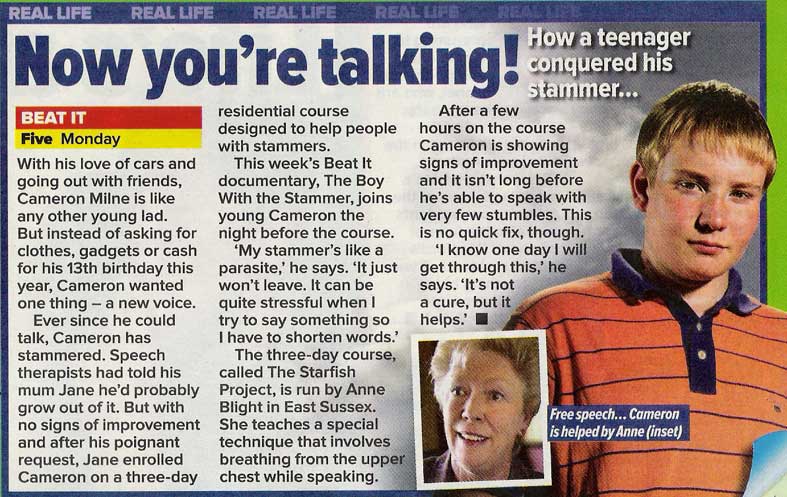
2. Beat It
Again, for my second style model, I have chosen to analyse another documentary. What is noticeable about this article is the colour scheme they have used to connote the mood of the documentary. The grey/navy blue connotes sadness and depression, which could be linked to the feelings the boy has because of the stammer. The text is, again, laid out so it is broken up and is easy for the reader to digest. The article is also dominated by images indicating what the article will be about. The boy in the picture is wearing an orange t-shirt, this connotes enthusiasm and warmth. The boy will probably be a likeable character as he struggles and triumphantly beats his stammer. At the top of the page is a banner, this lets the readers know what genre this programme fits under and therefore will appeal to fans of the genre.
 3. One Born Every Minute
In comparison to the other two articles I have analysed, this one if fairly basic in terms of graphology. The font used looks to be either Times New Roman or Georgia and the colour scheme is very basic. White is used predominately through the article and blue is the only bright colour that sticks out when looking at the article. This connotes medical environments and this is exactly what the article is about. The nurse outfits are iconographic and are used to denote what the documentary is about. The image of the nurse holding the baby will then give the reader an indication that the documentary is about childbirth. I think that this style model is far too basic, and for this reason I do not think I will produce my magazine article in the same style.
Proficient research into similar products.
ReplyDelete